Five Things I Loved about the BBC War & Peace Miniseries
As soon as I got back from the States in January, my husband and I rushed to catch up on the BBC’s War & Peace miniseries. It’s the latest costume drama from screenwriter Andrew Davies, who is behind many favorite literary adaptations, including Bleak House (2005). I enjoyed War & Peace much more than I expected to given my utter unfamiliarity with Russian literature. I can’t comment on how well the miniseries captures Tolstoy’s plot or tone; my response is just that of a literature lover who appreciates gripping television. (My understanding is that this has already shown in North America too, on various networks, but for those who haven’t watched it and still plan to, I’ll avoid spoilers in what follows.)
![Natasha Rostova's first ball, Leonid Pasternak [Public domain], via Wikimedia Commons.](https://commons.wikimedia.org/wiki/File:%D0%A0%D0%BE%D1%81%D1%82%D0%BE%D0%B2%D0%B0_%D0%BF%D0%B0%D1%81%D1%82%D0%B5%D1%80%D0%BD%D0%B0%D0%BA.jpeg)
Natasha Rostova’s First Ball, Leonid Pasternak [Public domain], via Wikimedia Commons.
2. The superb casting. At first it seemed strange to see Paul Dano, an indie movie favorite, in a TV role, but I quickly saw why he was just right for the part of earnest, indecisive Count Pierre Bezukhov. An illegitimate son who wants to live a meaningful life but keeps falling into dissolute behavior, Pierre unexpectedly inherits his father’s fortune and marries the wrong woman, yet turns personal disappointment to the good when he devotes himself to serving his fellow man through the Masons. With his little smile, deliberate speech and round glasses, Dano is perfect.
Initially Lily James, as Natasha Rostova, seems to be just like her bubbly, flirtatious Downton Abbey character, Lady Rose, but suffering and regret chasten her. I also loved Jim Broadbent as irascible Prince Nikolai Bolkonsky and Adrian Edmondson (especially with his fez and other assorted headgear) as the Micawber-ish Count Ilya Rostov. Callum Turner and Tuppence Middleton as Anatole Kuragin and Hélène Kuragina are a skeevy, scheming brother-and-sister pair worthy of Dangerous Liaisons.
3. The authentic settings. The series was filmed on location in Latvia, Lithuania, and Russia, including at the Catherine Palace outside St. Petersburg. It makes a difference to know this wasn’t shot in a London studio; the dachas, Orthodox churches and snowy vistas are all genuine.
4. The action scenes. The CGI crowd shots are unconvincing, but the up-close battle scenes are excellent: bombs, bayonets, amputations and all. Seeing one battle, Borodin, partially from Pierre’s viewpoint is an especially effective way of contrasting civilian life with soldiers’ daily reality.
5. The philosophical depth. I should have known what I was in for from a Russian novel, but I was startled afresh each time a character paused to stare death in the face or to question what his or her life was heading towards and consider how to change course. There are beautifully symbolic moments of forgiveness between separated sweethearts or former rivals. Another highlight is when Pierre, the rich count temporarily laid low, connects with a peasant and his dog. He even learns how to eat mindfully.
Now for something I didn’t like: with the mixture of cut-glass British and toned-down American accents, you’d be forgiven for thinking this takes place in an English-speaking country. It takes characters singing folk songs in Russian, wearing bearskin hats and participating in Orthodox rituals to remind you that, oh yeah, this is Russia. I’m not saying I wish the actors had all spoken in heavy Slavic accents, but especially after an extended period in a refined drawing room, it can be jolting to see onion domes and Cossack uniforms.
I’m not sure if I’ll ever read War & Peace; I have a feeling that, like Moby-Dick (an assigned book I never made it all the way through in college), it could have done with an editor. Even though I adore Tolstoy’s storyline and characters, I don’t think I’d have patience for long passages of historical exposition. Moreover, Philip Hensher (in a Guardian reader’s guide) thinks War & Peace has the worst opening and closing lines in literature. Actually reading the Russian masters can wait for another time.
For now, I’m happy to have seen this top-notch adaptation. In just six hours of television, Davies and director Tom Harper brought an epic world classic into vibrant life, full of romance, betrayal, sacrifice and redemption.
My rating: 
If you’ve already seen War & Peace and are interested in reading more about it, this appreciation piece by Clive James in the Guardian is great (but spoilers abound). See also this interview with Andrew Davies.
Have you seen the miniseries? If so, what did you think? I’m particularly interested to hear how it matched up to the book if any of you are familiar with both.
Images of Women Reading
I was going back through the 2015 miniature calendar my in-laws gave me for Christmas last year, “The Reading Woman,” and thought to myself what a strange set of images it featured. Perhaps the manufacturers were scraping the bottom of the barrel, because I had not seen a single one of these paintings before, and some were downright hideous. Even some that were aesthetically pleasing were ideologically a little weird: the women tend to look either vapid or downright unpleasant. This got me thinking about how reading women have often been portrayed in the history of art.
Bored; so rich she doesn’t know what to do with herself but read? Reading seems to be but one small step away from pure idleness.

Portrait of a Woman in a Fur Wrap, Herman Richir (Belgian)
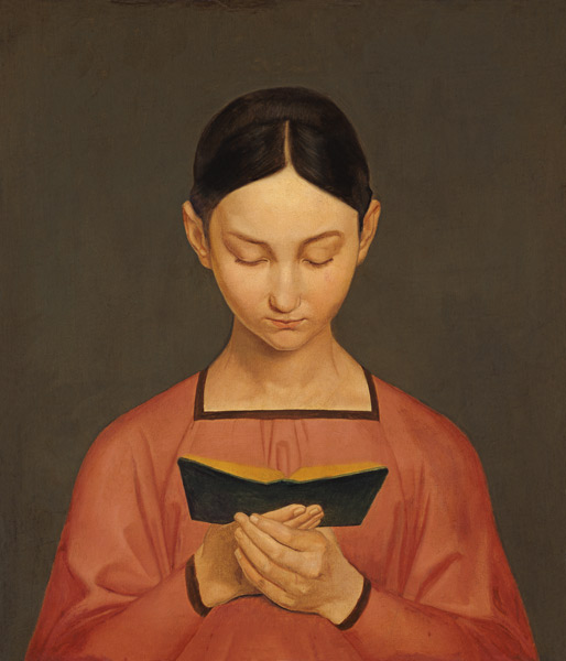
Ditto, except it’s a girl reading picture books. I don’t admire art this abstract.

Girl in Pink, c. 1906, Samuel John Peploe (Scottish)
These next two women could only be described as unfortunate-looking, if not masculine. Perhaps people worried that too much reading would rob women of their natural femininity?

Woman Reading, 1913, Rik Wouters (Belgian)

Caterina Reading a Book, c. 1888, James Kerr-Lawson (Scottish)
Here’s a sweet one. The subject seems pensive, even troubled. Is it by what she’s reading, or is the book her temporary solace from life? I love the colors and the faint echo of the Pre-Raphaelite style. Interesting also to see that it’s by a female painter – all these others have been male visions.

Portrait of Winifred Roberts, c. 1913, Eleanor Fortescue-Brickdale
Now this one I really love. The hues and textures in this Renoir-esque painting are soft and inviting, and the subject is looking straight at the painter with a confident, almost flirtatious air. She’s no stick-in-the-mud who’s picked up a book because she has nothing better to do. It’s no wonder this was chosen as the calendar’s cover image.

Parisienne Reading, 1880, Albert Gustaf Aristides Edelfelt (Finnish)
Beyond the calendar, a couple of reading women paintings I’ve always liked are by Sir John Lavery and Mary Cassatt. In the former I appreciate how the book cover matches the subject’s lips, and how she seems absorbed without being inaccessible.
![Miss Auras, c. 1900, Sir John Lavery [Public domain, via Wikimedia Commons]](https://commons.wikimedia.org/wiki/File:Lavery_Maiss_Auras.jpg)
Miss Auras, c. 1900, Sir John Lavery [Public domain, via Wikimedia Commons]
![Woman Reading in a Garden, 1880, Mary Cassatt [Public domain, via Wikimedia Commons]](https://commons.wikimedia.org/wiki/File:Mary_Cassatt_Woman_Reading_in_a_Garden.jpg)
Woman Reading in a Garden, 1880, Mary Cassatt [Public domain, via Wikimedia Commons]
Two of the most common images of women reading (you see these turning up as users’ avatars on Goodreads all the time) are by Jean-Honoré Fragonard and Gustav Adolph Hennig. I think they’re so popular because of the warm shades, the straightforward composition, and the subject’s apparent indifference to being watched. These are plucky heroines you feel you can relate to.
![A Young Girl Reading, c. 1770, Jean-Honoré Fragonard [Public domain, via Wikimedia Commons]](https://commons.wikimedia.org/wiki/File:Fragonard,_The_Reader.jpg)
A Young Girl Reading, c. 1770, Jean-Honoré Fragonard [Public domain, via Wikimedia Commons]
Lesendes Mädchen, 1828, Gustav Adolph Hennig
Do you have any favorite – or least favorite – paintings of women reading?
