As I did in 2019, 2020, 2021, and 2022, I’ve picked out some favourite book covers from the past year’s new releases. Gone are the days of mostly flora and fauna covers and abstract faces. Last year it was all about colour blocks and textures, with some partial images of female bodies. This year it’s a more random selection.
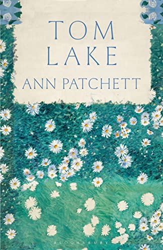
Gustave Caillebotte is one of my favourite painters, so I appreciated the use of his simple Bed of Daisies as the cover of Ann Patchett’s Tom Lake (though I still think the book could have had a more evocative title, such as The Cherry Orchard).
I lied; there was still a bit of flora and fauna this past year – those daisies, and the abstract trees, bunch of flowers and dangling creatures below:

The cover of Tomb Sweeping by Alexandra Chang reminded me of a bento box or comic strip.

I was also into the swirly lines (often signifying fire) this year:

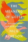
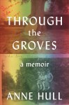
And these all stood out to me for their use of colours and font (the Acheson and Hull are almost twins):


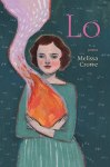
The sad truth is that for many of the above I liked the covers more than the contents, with exceptions being the Crowe, Napolitano and Patchett.
What cover trends have you noticed this year? Which ones tend to grab your attention?

Whenever I see the ridiculous ad for Marc Jacob’s perfume, Daisy, I think of Tom Lake, now. I’m sure perfumiers have a competition for the most ludicrous videos every Christmas.
LikeLike
Aren’t the overlapping voices chanting “daisy daisy daisy” in the background of these ads also vaguely terrifying and cultish? I’ve never been sure what Marc Jacobs is going for there.
LikeLike
That’s it! Vaguely hippie.
LikeLike
As I don’t have a telly, I usually miss phenomena like this!
LikeLiked by 1 person
You’re spared!
LikeLike
I am undoubtedly influenced by covers (I’m so shallow!), but at the same time, once read, cover forgotten. I haven’t read any of yours shown here, so on the basis of cover alone, I’m going for Tomb Sweeping, because the tile images intrigue me.
LikeLiked by 1 person
Tomb Sweeping is short stories set in China or among Chinese Americans. I didn’t like it as much as the cover led me to hope. My Shelf Awareness review: https://www.shelf-awareness.com/issue.html?issue=4500#m60342
LikeLiked by 1 person
I’ll follow that up – thanks.
LikeLike
I do love covers, but there’s a kind of uniformity of cover design in various subgenres of publishing that has—presumably—the opposite effect to that intended, and makes me avoid the books. Cutesy minimalism (like the cover of The List), or, on the other hand, baroque ornamentation (cf. Stacey Hall’s covers, Bridget Collins’s covers, etc.) have struck me as the most repeated trend.
LikeLiked by 1 person
Oh yes, the entwined foliage with opulent books and keys and crows! I guess it’s all to do with marketing: they hope readers will think, ‘that looks like X, which I enjoyed, so I’ll give Y a try too.’ At the library I notice all the poor but plucky young women on the covers of the historical fiction set in Liverpool slums in wartime. There are 3 or 4 authors who write in that very specific vein but all of their books look exactly the same. And with romance novels, of course, people seem to like to know what they’re getting into. The comfort of genre reading?
LikeLike
I will be happy to see the back of the trend for obscured women’s faces on covers…
LikeLiked by 1 person
There are still too many crime novels working the turquoise and yellow vibe.
LikeLiked by 1 person
Huh. Was that even before the Ukraine conflict?
LikeLike
Yes, it’s been a couple of years now.
LikeLike
I mainly read electronically so covers are irrelevant.
However, I did love the cover to Lapidarium by Hettie Judah.
Worst cover – Comfort Eating by Grace Dent. Loved the book but Grace in Battenburg hair curlers on the cover was awful.
LikeLike
So sorry your comment went to Spam; I’m not sure why that happened. Does the cover play any role in enticing you to read a book? (While browsing the library or Kindle selection, for instance?) Ooh, that swirling rock cover is gorgeous. And yes, that curlers image was terrible.
LikeLike
Ah, that explains where it went!
No, the cover plays absolutely no part in what I read. However, the number of times I hear about people going into a bookshop and picking up the book purely because of what it looks like! If I ever write a book (ain’t going to happen) I’d throw money at the cover like there was no tomorrow!
LikeLiked by 1 person
I also loved the Tom Lake cover – perfect for an old-fashioned-in-the-best-way book.
LikeLiked by 1 person
Maybe I’m misremembering…don’t you usually have a much longer post about this for your EOY themes? But I suppose some years have more memorable covers than other years. (I don’t pay a lot of attention, I guess, to cover art. And I likely should.)
LikeLiked by 1 person
It has certainly been a longer post in previous years. It all depends on how many books I put on my “cover love” Goodreads shelf that year! Previously there’s been a bonanza of flora and fauna covers, which I couldn’t get enough of.
LikeLike
[…] I did in 2019, 2020, 2021, 2022, and 2023, I’ve picked out some favourite book covers from the past year’s new releases, about half of […]
LikeLike
[…] I did in 2019, 2020, 2021, 2022, 2023 and 2024, I’ve picked out some favourite book covers from the past year’s new releases. This […]
LikeLike