Cover Love 2025
As I did in 2019, 2020, 2021, 2022, 2023 and 2024, I’ve picked out some favourite book covers from the past year’s new releases. This time, I’ve read all of the books featured!
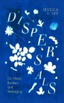
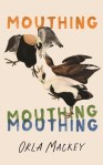
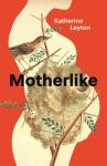
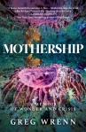
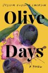
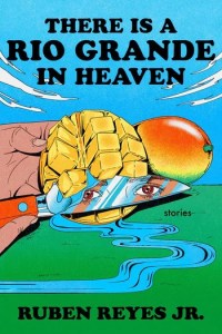
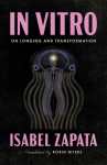
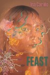
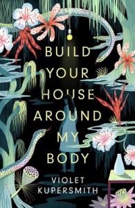
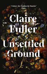
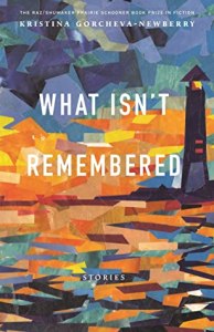
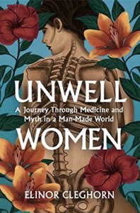
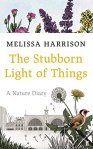
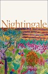
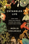
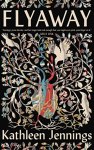
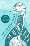
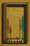
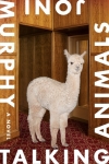
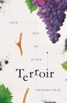
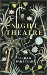
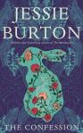
I’m drawn to flora and fauna on book covers; and to adapted artworks.


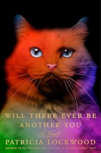
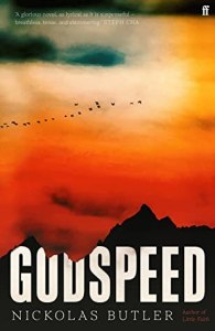
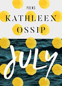
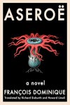
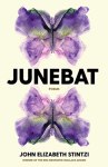
These two stood out for their psychedelic colour choices.

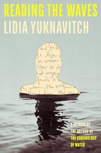
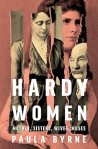
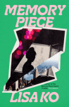
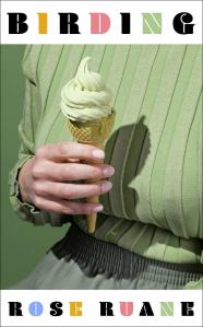
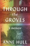
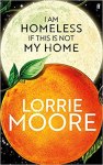
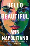
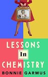
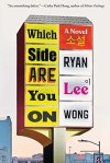
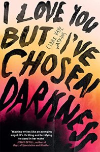
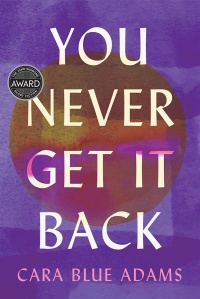
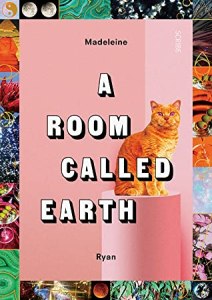
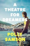
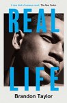
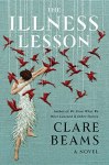
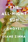
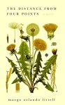
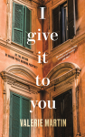
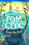
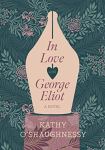
I like an unusual, elegant font. Can anyone identify the one below? I actually wonder if I would have chosen to read all four books had the font not attracted me.
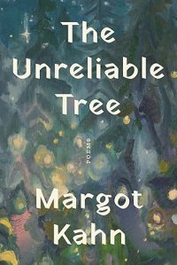
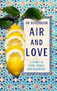
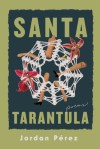
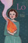
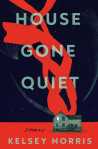
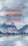
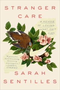
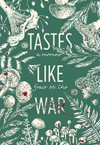
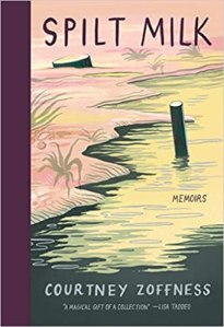
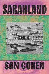
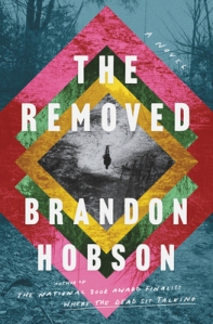
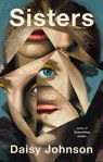
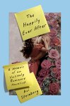
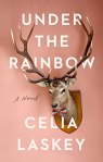
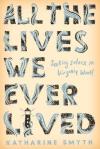
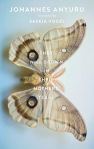
Neat that the image and/or (most of the) title are vertically aligned – a rarer choice.
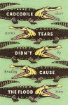
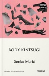
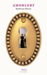
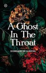
I found this paper cut-out striking, and loved how a cheekily torn matchbook gives the middle finger.

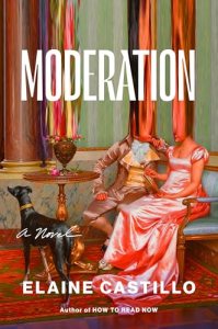
But my two favourite title and cover combinations of the year were:
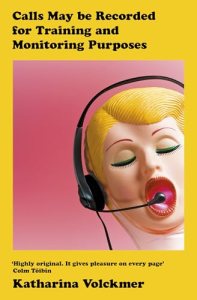
- Calls May Be Recorded for Training and Monitoring Purposes by Katharina Volckmer – The cover is totally appropriate to the bonkers and raunchy contents (see my Shelf Awareness review – even though I technically reviewed the North American release I’m sticking with the full title and sex doll of the UK edition).
(Overall favourite:)
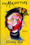
- Pan by Michael Clune – The cover perfectly captures the mood of this weird novel about a teenage boy who has panic attacks and muses about attributing them to the god Pan. The painting snippet is from The Drunkenness of Noah by Camillo Procaccini; but the eyes, look at those eyes!

Postscript: In January 2026, Lit Hub chose their 75 best book covers of the past decade. Pan tied for third place for 2025.
What cover trends have you noticed this year? Which ones tend to grab your attention?
Cover Love 2024
As I did in 2019, 2020, 2021, 2022, and 2023, I’ve picked out some favourite book covers from the past year’s new releases, about half of which I’ve read. Abstract faces? Colour blocks? Partial female bodies? You never know what will dominate.
I’m sure to be drawn to flora and fauna on book covers, especially when they intertwine uniquely or adapt an artwork.


I also tend to like fruit on a cover. Here is one good example (gorgeous tiles)…
…followed by two awful ones (even though the books themselves, both speculative short story collections I read for paid reviews, were great!). Some will probably love these designs, but the first makes me think of late-1990s clip art and the other is like a crap still life.

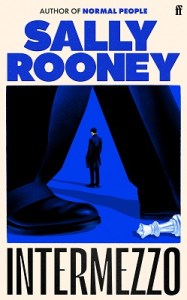
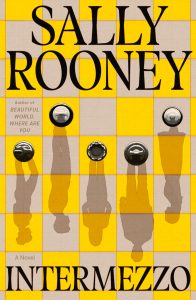
I almost always prefer the U.S. cover to the U.K. cover, and the latest Sally Rooney was no exception. Sorry, Faber, but the cover at left does not do the novel justice. Brilliant job, though, Farrar, Straus and Giroux: a perfect way of depicting the central characters and their dynamics via their shadows on a chess board, and having them upside down makes things that little bit off-kilter.
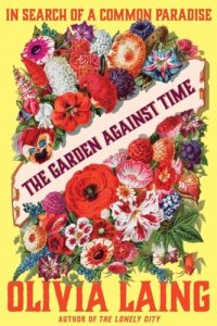
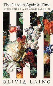
However, the opposite was the case with this Olivia Laing book: the colours and font seem too garish on the Norton edition at left, whereas the blooms slipping through the slats of a white bench on the Picador cover are more elegant and fitting for her style.
I also like a striking font. I loved the contrast between the historical cheekiness of the painting and the contemporary, sans serif, lime green lettering here.

The same goes for the below; I also like that the title goes vertically down the page – a rarer choice.

The rowhouses, the green swoop to simulate the road trip contained therein, the colours, the bold title going over two lines … I have my doubts as to whether this novel can live up to its fabulous packaging:

Similarly, everything about these two covers is fantastic … but the books were DNFs for me, alas:

More themes, or odd ones out
Fractured or distorted faces:


Torn, cut or folded paper:
Overlapping words form a relevant shape:

Pastel kitsch:
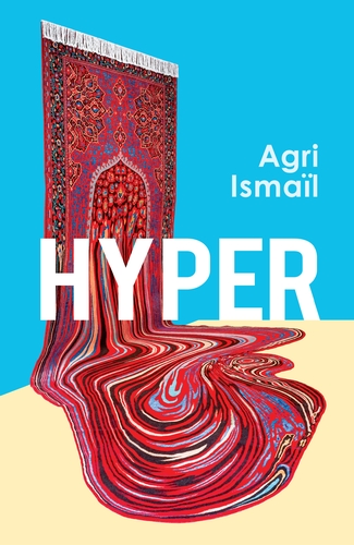
But my favourite cover of the year is for Hyper by Agri Ismaïl. The artwork, Doubts? (2020) by Faig Ahmed, is a handmade wool carpet. The cover and title honestly have nothing to do with the contents of the novel, but I love that symbolic melting into abstraction.
On which, see also my close second place. Painterly swirls almost mimic the view through a microscope, and what a classy font, too: Transgenesis by Ava Winter.
![]()
(See also Kate’s and Marina Sofia’s book cover posts.)
What cover trends have you noticed this year?
Which ones tend to grab your attention?
Cover Love 2023
As I did in 2019, 2020, 2021, and 2022, I’ve picked out some favourite book covers from the past year’s new releases. Gone are the days of mostly flora and fauna covers and abstract faces. Last year it was all about colour blocks and textures, with some partial images of female bodies. This year it’s a more random selection.
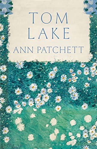
Gustave Caillebotte is one of my favourite painters, so I appreciated the use of his simple Bed of Daisies as the cover of Ann Patchett’s Tom Lake (though I still think the book could have had a more evocative title, such as The Cherry Orchard).
I lied; there was still a bit of flora and fauna this past year – those daisies, and the abstract trees, bunch of flowers and dangling creatures below:

The cover of Tomb Sweeping by Alexandra Chang reminded me of a bento box or comic strip.

I was also into the swirly lines (often signifying fire) this year:
And these all stood out to me for their use of colours and font (the Acheson and Hull are almost twins):

The sad truth is that for many of the above I liked the covers more than the contents, with exceptions being the Crowe, Napolitano and Patchett.
What cover trends have you noticed this year? Which ones tend to grab your attention?
Cover Love: My 13 Favourite Book Covers of 2022
As I did in 2019, 2020, and 2021, I’ve picked out some favourite book covers from the year’s new releases. Fewer have stood out to me this year for some reason, so it’s just a baker’s dozen here, and all of them are from books I’ve actually read.
Usually it’s the flora and fauna covers that get me. Not so many of those this year, though!

Instead, it was mostly about colour blocks and textures.


And a few of my favourites feature partial images of female bodies:


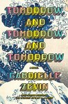
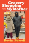
I also appreciate the use of a blocky 1980s-reminiscent font on these two. It’s appropriate to the contents in each case. Powell’s poems are loosely inspired by/structured like an old-school hip-hop album, and Zevin’s novel is about the love of vintage video games.
What cover trends have you noticed this year? Which ones tend to grab your attention?
Cover Love: My Favourite Book Covers of 2021
As I did in 2019 and again last year, I’ve picked out some favourite book covers from the year’s new releases. In general, slap some flora and/or fauna on and I’m going to be drawn to a book. A lot of these covers are colourful and busy; on some later ones the layout is more stark.
Here are my favourite covers from books I’ve actually read:


Plus a couple I’ve read whose covers aren’t quite like the others (I like swirly lines):


I prefer the U.S. cover (left) to the U.K. cover in these three cases:


And I’ve noticed these particular fonts seem popular nowadays:


Here are some covers that caught my eye even though I’ve not read the books themselves (or maybe don’t plan to):


A few even buck the flora/fauna trend, employing interesting lines, shapes or perspective instead.


And I think these would be my absolute favourites:
What cover trends have you noticed this year?
Which ones tend to grab your attention?
Cover Love: My Favorite Book Covers of 2020
As I did last year, I’ve picked out some favorite book covers from the year’s new releases. In general, slap some flora and/or fauna on and I’m going to be drawn to a book. Sometimes these covers are colorful and busy; other times the layout is more stark.
Here are my favorite covers from books I’ve actually read:


Plus a few I’ve read whose covers aren’t quite like the others:

I prefer the U.S. cover (left) to the U.K. cover (right) in these four cases:


And here are covers that caught my eye even though I’ve not had a chance to read the books themselves (including USA-only releases and books my library doesn’t own):


A few even buck the flora + fauna trend, employing interesting lines, shapes or perspective instead.


If I had to narrow it down, I think these three would be my absolute favorite covers of 2020:
What cover trends have you noticed this year?
Which ones tend to grab your attention?
Cover Love: My Favorite Book Covers of 2019
I’ve picked 26 favorite book covers from 2019, most of which are on books I haven’t yet managed to read – either they’re U.S.-only releases, or my library doesn’t own a copy. In the past I have sometimes found that the most eye-catching covers and the most striking titles end up belonging to disappointing books, but at least a few have bucked that trend.
Here are my favorite covers from books I have actually read or am currently reading:

And here are the rest:


What have we learned from this exercise? That I’m a total sucker for flora and fauna on book covers, especially birds. (Bizarrely, rabbits/hares make four appearances, too.)
What cover trends have you noticed this year?
Which tend to grab your attention?
How I Did on My 2018 Reading Goals & The Year’s Cover Trends
The year-end coverage continues!
So, how did I do with the 2018 reading goals I set for myself about this time last year? Rather poorly! is the short answer.
- I only read one book that might be considered a travel classic (by Patrick Leigh Fermor), though I did read some modern travel books.
 I only read Ali and the first half of a biography of May Sarton. What I’d envisioned being a monthly biography feature on the blog turned into a one-off.
- I need to work out my literature in translation percentage and compare it to last year’s to see if I’ve improved at all.
However, I do feel that I did well at reading my own books, as boosted by my 20 Books of Summer being chosen exclusively from my own shelves. Once I’m back from America I’ll have to do another full inventory and see how many unread books are still in the house, as compared to the 327 at this time last year.
Out of my 31 most anticipated reads of the second half of the year, I read 20 (of which 5 were at least somewhat disappointing), abandoned 2, still have 2 to read, lost interest in 1, have 1 in progress, and can’t find 5. For the whole year, the statistics are at 38/61 read (13 disappointments = more than 1/3 – that’s really bad and needs to be fixed!), 7 DNF, 4 still to read, 9 not found, 2 lost interest, and 1 in progress.
As for my non-reading-related goal … my accordion-playing fell by the wayside in July because I went away to America for three weeks unexpectedly, and after that never got back into the habit of daily practice and biweekly lessons the other side of Reading. I’d still like to pick it back up in the near future. I was at a point where I knew five notes and a few bass chords and could play both hands on a number of very simple tunes.

The poor cat was alarmed at yet another folk instrument entering his abode.
This Year’s Cover Trends
Mostly flora, which I noticed before 2018 had even begun.


The other one that kept jumping out at me was rubber gloves. Weird!


I’ll be back on the 26th to begin the countdown of my favorite books of the year, starting with nonfiction.
