As I did in 2019, 2020, 2021, 2022, and 2023, I’ve picked out some favourite book covers from the past year’s new releases, about half of which I’ve read. Abstract faces? Colour blocks? Partial female bodies? You never know what will dominate.
I’m sure to be drawn to flora and fauna on book covers, especially when they intertwine uniquely or adapt an artwork.


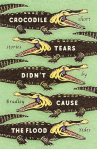


I also tend to like fruit on a cover. Here is one good example (gorgeous tiles)…

…followed by two awful ones (even though the books themselves, both speculative short story collections I read for paid reviews, were great!). Some will probably love these designs, but the first makes me think of late-1990s clip art and the other is like a crap still life.


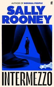
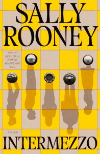
I almost always prefer the U.S. cover to the U.K. cover, and the latest Sally Rooney was no exception. Sorry, Faber, but the cover at left does not do the novel justice. Brilliant job, though, Farrar, Straus and Giroux: a perfect way of depicting the central characters and their dynamics via their shadows on a chess board, and having them upside down makes things that little bit off-kilter.
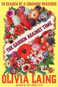
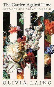
However, the opposite was the case with this Olivia Laing book: the colours and font seem too garish on the Norton edition at left, whereas the blooms slipping through the slats of a white bench on the Picador cover are more elegant and fitting for her style.
I also like a striking font. I loved the contrast between the historical cheekiness of the painting and the contemporary, sans serif, lime green lettering here.

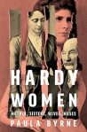
The same goes for the below; I also like that the title goes vertically down the page – a rarer choice.

The rowhouses, the green swoop to simulate the road trip contained therein, the colours, the bold title going over two lines … I have my doubts as to whether this novel can live up to its fabulous packaging:

Similarly, everything about these two covers is fantastic … but the books were DNFs for me, alas:

More themes, or odd ones out
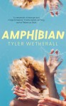
Fractured or distorted faces:


Torn, cut or folded paper:


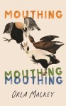
Overlapping words form a relevant shape:

Pastel kitsch:
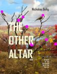
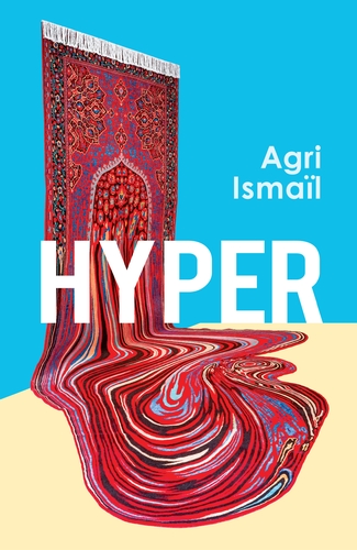
But my favourite cover of the year is for Hyper by Agri Ismaïl. The artwork, Doubts? (2020) by Faig Ahmed, is a handmade wool carpet. The cover and title honestly have nothing to do with the contents of the novel, but I love that symbolic melting into abstraction.
On which, see also my close second place. Painterly swirls almost mimic the view through a microscope, and what a classy font, too: Transgenesis by Ava Winter.
![]()
(See also Kate’s and Marina Sofia’s book cover posts.)
What cover trends have you noticed this year?
Which ones tend to grab your attention?

I haven’t kept a record of favourite covers in previous years but without doubt, this year I’ve been drawn to skies and cliffs.
Of the ones you’ve highlighted, I would absolutely pick up the Laing (either cover), Housemates and I’m Mostly Here to Enjoy Myself.
LikeLiked by 1 person
Do Aus books tend to have their own covers for the big releases, e.g. Sally Rooney?
LikeLike
I’m amazed at how very different US and UK covers can be. Like you, I much prefer the US Rooney jacket. I’ve yet to read it but the UK one tells me very little about the book
LikeLiked by 1 person
I agree — it has that subtle chess reference but the ominous dark blue and looming legs seem odd.
LikeLiked by 1 person
I’m not sure I’m loving current cover trends, tbh. I admire their subtlety but I do like covers that are more straightforward. I think I often like covers that incorporate photographs in a clever way e.g. https://www.amazon.co.uk/Gender-Theory-Madeline-Docherty-ebook/dp/B0CCD18TZ9 (though I wouldn’t have put it sideways!) or https://www.goodreads.com/book/show/199516514-plaything
LikeLiked by 1 person
I like how the shadow is bent in half on Plaything. I also find it interesting when a title is cut in half (‘enjambment’, almost), like Housemates above or The Safekeep UK cover.
LikeLiked by 1 person
Ooh, just spotted this via a Goodreads friend’s Substack: https://www.goodreads.com/book/show/221929600-we-pretty-pieces-of-flesh V. similar to Gender Theory what with the sideways photo, and the girlhood theme and Northern setting make it seem perfect for you! (See Blair’s review on the Goodreads page.)
LikeLiked by 1 person
Ooh love a noughties setting! Also love the photo on the cover but I hate the font ☹️
LikeLike
Ooh, I like the cover for Hyper a lot too! It’s just occurred to me that the US cover for the Laing is probably meant to mimic a vintage seed catalog, similar to this: https://www.etsy.com/listing/175456104/vintage-st-louis-seeds-seed-catalog
LikeLiked by 1 person
Or indeed the Old Farmer’s Almanac: https://www.mymcmedia.org/wp-content/uploads/2024/08/2025-Almanac-Classic-Wildflowers-544×408.jpg
LikeLiked by 1 person
Nicely spotted — I’m sure you’re right that they were going for vintage with the font and image.
LikeLiked by 1 person
Excellent post! That marbled one at the end, though – marbling always makes me giggle as there is a story about my husband, doing marbling at primary school: he sucked instead of blowing and (presumably) drank the paint! Well before I knew him of course. Those faces are a bit disturbing, I have to say! Though better than all those headless women of a while ago.
LikeLiked by 1 person
Ew, that puts a different slant on things 😉
LikeLiked by 1 person
This is so interesting. Particularly the Olivia Laing book. I’ve just read it but hadn’t seen that the yellow cover existed since I own the white garden bench edition. What a difference it makes. I can’t believe the author would have liked those garish yellow and red colours. The Picador one is much calmer and more distinguished.
LikeLiked by 1 person
I agree the white cover is just much more suitable.
LikeLiked by 1 person
Excellent post although I would NEVER choose a book by its cover!
My two favourites this year are Cairn by Kathleen Jamie which is beautiful and perfect in every way (as is the book itself).
And I also loved the cover to the latest Murakami book – The City and its Uncertain Walls. I’m not sure exactly why I love it so much but it just seems to encapsulate the surreal world that this author takes you to.
Wishing you a very happy Christmas Rebecca, and many thanks for an excellent blog which I always enjoy reading (especially the Love your Library posts).
LikeLiked by 1 person
We all choose books by their covers to some extent!
Yes, the Murakami is a good one, and the UK cover says so much more about the book than the US cover. (I’m about 100 pp. in right now).
I can see why you admire the simplicity of the Cairn cover, though I felt the contents fell short of her other work.
Happy Christmas! And thank you for reading.
LikeLike
I can’t say I’ve paid attention to any trends, but I certainly have seen some beautiful covers. That last one you showed was gorgeous.
LikeLiked by 1 person
Liz helped me locate the word I wanted: “marbling.” Maybe I like it so much because it reminds me of old-fashioned marbled endpapers.
LikeLiked by 1 person
Nice!
LikeLike
What a fun thing to do. Thanks for sharing!
LikeLiked by 1 person
Glad you enjoyed!
LikeLike
The Reading Glasses podcast had as one of their Reading Challenges this year to pick a book based solely on the cover. I might try that for next year. I think my favorite of the ones you included is Catland.
LikeLiked by 1 person
Catland does seem like a book I need to read!
LikeLike
This is a striking collection! I am also a fan of florals, and the contrast between a neon font and a classical painting. One trend I’ve noticed, mostly in YA, is lush illustrated covers with lots of layers/patterns. I love those covers, even though they’re usually on books I’m not interested in reading.
LikeLiked by 1 person
Ah yes, and there’s those bookish secret society type of novels (like The Binding or The Cloisters) with the complicated floral covers featuring keys, etc.
LikeLiked by 1 person
I’m sitting on the couch with Laila admiring Catland (our butts and pant legs likely covered with fur too)!
Your Dispersals isn’t as colourful a cover as the version I read (IMO, obviously, https://www.penguinrandomhouse.ca/books/711071/dispersals-by-jessica-j-lee/9780735245549), but I do agree with your UKvsUS selections. Although I’m not sure I love the US Rooney, only that I don’t connect with the UK at all.
Every year I love reading your thoughts on covers, but it’s not something I think about in the same way (and maybe that’s why I really enjoy scrolling through your thoughts about them).
LikeLiked by 1 person
That’s a lovely cover as well, but I am particularly fond of the bluey watercolor wash one — when we were in Dunbar, Scotland in September there was an exhibition of art at the John Muir birthplace museum that had loads of paintings like it. I can’t remember now what they called the technique but it’s very striking.
LikeLike
Ahhh, I can see where that kind of experience would enhance a viewer’s response.
LikeLike
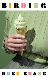
[…] by Rose Ruane – For the cover if nothing else (it made my Cover Love post last […]
LikeLike
[…] I did in 2019, 2020, 2021, 2022, 2023 and 2024, I’ve picked out some favourite book covers from the past year’s new releases. This time, […]
LikeLike