As I did in 2019, 2020, 2021, 2022, 2023 and 2024, I’ve picked out some favourite book covers from the past year’s new releases. This time, I’ve read all of the books featured!
I’m drawn to flora and fauna on book covers; and to adapted artworks.
These two stood out for their psychedelic colour choices.
I like an unusual, elegant font. Can anyone identify the one below? I actually wonder if I would have chosen to read all four books had the font not attracted me.
Neat that the image and/or (most of the) title are vertically aligned – a rarer choice.
I found this paper cut-out striking, and loved how a cheekily torn matchbook gives the middle finger.
But my two favourite title and cover combinations of the year were:
- Calls May Be Recorded for Training and Monitoring Purposes by Katharina Volckmer – The cover is totally appropriate to the bonkers and raunchy contents (see my Shelf Awareness review – even though I technically reviewed the North American release I’m sticking with the full title and sex doll of the UK edition).

(Overall favourite:)
- Pan by Michael Clune – The cover perfectly captures the mood of this weird novel about a teenage boy who has panic attacks and muses about attributing them to the god Pan. The painting snippet is from The Drunkenness of Noah by Camillo Procaccini; but the eyes, look at those eyes!

Postscript: In January 2026, Lit Hub chose their 75 best book covers of the past decade. Pan tied for third place for 2025.
What cover trends have you noticed this year? Which ones tend to grab your attention?






Too many are jumping on the trend of floral covers and also those cartoon-like illustrations currently. They felt fresh and original couple of years back but now everyone is doing them.
LikeLiked by 1 person
The flora covers have been popular for 5-10 years. I don’t mind!
LikeLike
I like that font you mention too, and realise I’ve seen it around a lot – no idea what it’s called but I’m sure there are typeheads who would know! I read far fewer truly contemporary releases this year, so I’m less attuned to cover trends, but I thought the UK cover for Garth Greenwell’s Small Rain was perfect, while Eliana Ramage’s To the Moon and Back was shortchanged in both US and UK versions.
LikeLiked by 1 person
I tried running a couple of those cover images through a reverse font detector but it didn’t give me consistent results.
The U.S. cover of the Greenwell is even more minimalist — basically just pure blue with what might be a raindrop’s trajectory bisecting.
LikeLike
It’s definitely classy!
LikeLike
I’m always amazed by the amount of people that choose a book purely by its cover!
My favourite this year is an absolute lesson in ‘less is more’. It’s Mother Mary Comes to Me.
Simple, clever, beautifully done with no flowers!
Excellent book too!
LikeLiked by 1 person
By Arundhati Roy
LikeLike
We all judge books by their cover to some extent!
LikeLike
Great post! Love that cover for Pan
LikeLiked by 1 person
It certainly caught my eye!
LikeLiked by 1 person
I can’t think of any trends but two I particularly liked this year were Seascraper and The Imagined Life which seemed to catch the novels well. I also like the covers for Jenny Mustard’s novels for the same reason – quiet, well drawn and everyday.
LikeLiked by 1 person
Looks like you appreciate a simple photograph or painting, with a sans serif font and lettering that doesn’t take up much of the image 🙂
LikeLiked by 1 person
I have seen that font and tried to identify it using a program, but the results I got were ridiculous and didn’t match at all.
LikeLiked by 1 person
I need an insider to identify it for me!
LikeLiked by 1 person
I used to be one, but no more.
LikeLike
I think those font identifiers are just trying to sell you fonts. They matched the sample to a bunch of fonts that didn’t match it at all, and none of them were mainstream.
LikeLike
Writing the Waves looks thoughtful (deep?). I’m all for a simple cover – but I like to note something regarding the story within as well. I am not impressed when a cover is too busy. My book from the McKitterick Prize long list was published last week, Rebecca. It’s on Amazon, if you’d like to see it with a cover, all dressed for Christmas giving! The eBook cover is different to the paperback/hard cover book. The US site: https://www.amazon.com/Missing-Village-Touch-learn-remains/dp/1763859800/ref=tmm_pap_swatch_0
Jill
LikeLiked by 1 person
Reading the Waves is definitely a deep dive into the self; my issue with it was that it repeats a lot of content from Yuknavitch’s previous memoir.
Congratulations! Great choice of painting for the cover.
LikeLiked by 1 person
Like Susan, I particularly liked Seascraper’s cover. Also The Wax Child and A Long Winter. Pick the bones out of that selection!
LikeLiked by 1 person
Similar to Susan, you like a simple painting or photograph and a sans serif font 🙂
LikeLiked by 1 person
so many great ones here!
You will discover my favorite cover when I do my 2025 stats early January
LikeLiked by 1 person
I love this annual visual: thank you for putting it together every year and sharing it with all of us! Also, I don’t think I’d’ve even noticed that match in the matchbook, so it really made me laugh when you remarked on it and made me pay attention. Even though I really like the cover for Maria Reva’s Endling (one of my 2025 faves for sure), I love that cloud cover. (Oh, clooooooud cover? Hah)
LikeLiked by 1 person
The North American cover of Endling is a great one, too. The swirling lines and wavy font let you know you’re in for a wild ride!
LikeLike
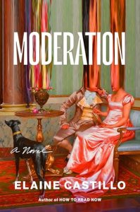
I do like the Moderation cover and the way interior font choices for chapter headings match its faux-Regency aesthetic. Not quite sure it reflects the book, though!
LikeLiked by 1 person
No — I liked the cover more than I liked the book in the end! But I guess it’s meant to reflect the slightly warped romance plot.
LikeLiked by 1 person